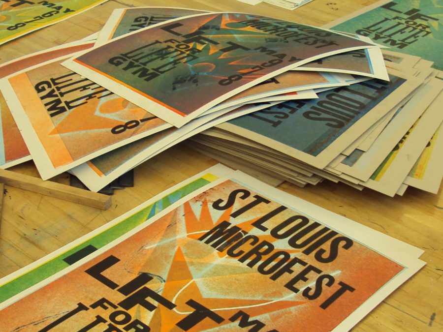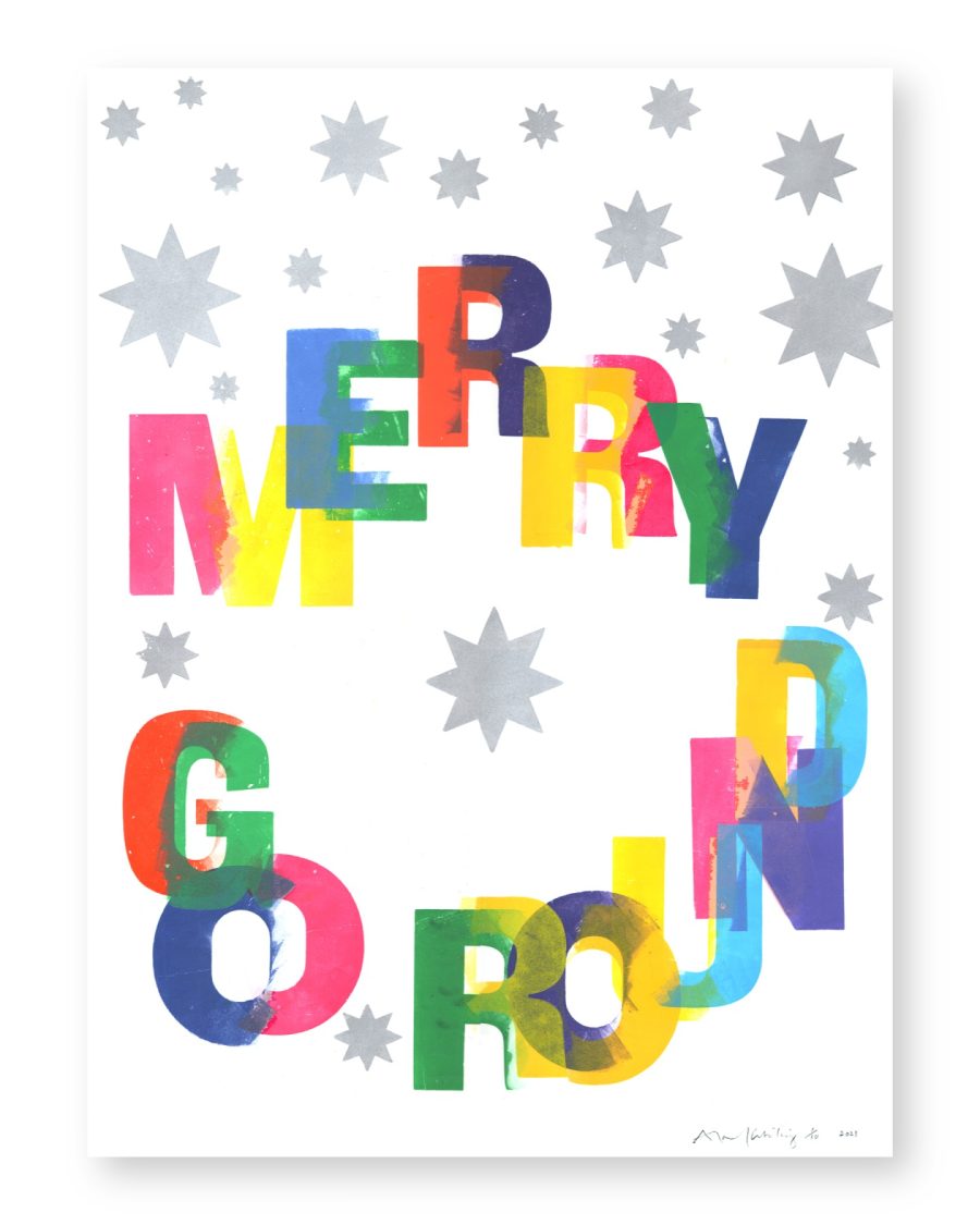
A repeat private client commissions a holiday card from us most years, and this run was matched to a Pantone spot color pulled from their own household stationery rather than picked fresh — a good example of why we keep a mixing log under our Custom Pantone Spot Mix ink program, since matching a color from three years prior meant pulling that job’s actual drawdown record rather than re-eyeballing it against a swatch book that may have shifted.
We printed on Crane’s Lettra for the deep, tactile impression a holiday card benefits from when it’s going to sit propped on a mantel rather than get filed away, single-color, in a small run sized to the client’s mailing list rather than a round marketing number.