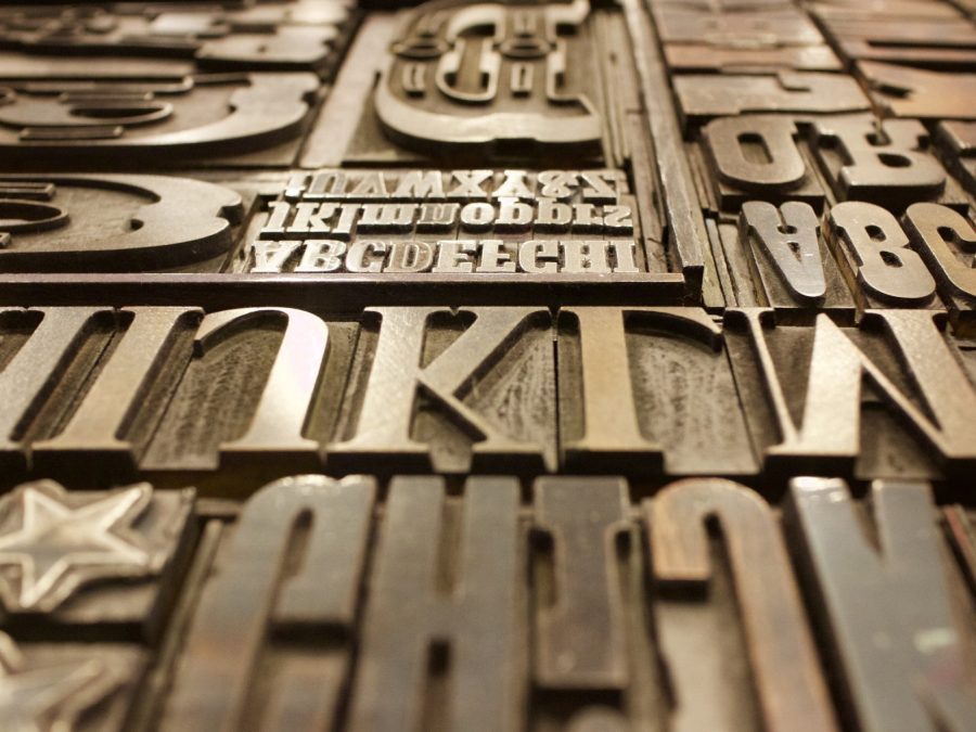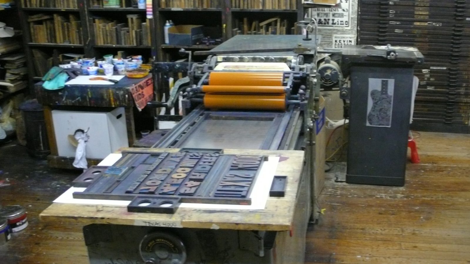
Modern letterpress has a reputation for a deep, almost 3D impression — you can run a finger over the back of the sheet and feel every letterform. That look is fashionable right now, but it’s also, historically, considered a defect: traditional fine letterpress printing (the kind these presses were built to do commercially for a century before offset took over) aimed for a kiss impression, just enough contact to lay ink evenly with no visible bite at all.
We’ll print either way, but we tell clients plainly which one they’re asking for and why it matters for stock choice — a deep bite needs a thicker, more forgiving sheet like Lettra or duplexed Cotton Rag, or the reverse side will show through and the fine detail in small type will blur as the paper stretches around the letterform’s edges. Push the impression too deep on the wrong stock and the type doesn’t look intentional, it looks like the press was set up wrong, which it was.